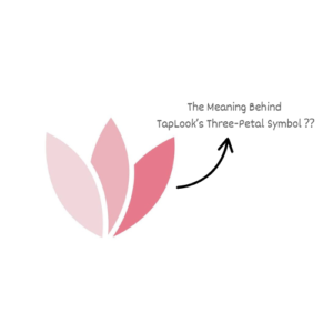
The three petals are subtly inspired by the sacred lotus flower, a revered symbol in Buddhism that represents kindness, purity, and compassion. From this spirit, TapLook spreads love, care, and gentle beauty to senior clients on their journey to restore their natural elegance.

At the same time, the three petals resemble a sprouting clover leaf, a symbol of luck, hope, and new beginnings. Each petal reaches outward like an open hand, representing TapLook’s global mission to touch the hearts and beauty needs of older adults around the world.
The petals are designed with softness and grace, much like the gentle, skillful hands of TapLook professionals, artisans who beautify not only with technique, but also with loyalty, patience, and heart. They bring natural, harmonious beauty to life, not flashy or exaggerated, but subtle, refined, and emotionally uplifting.
The soft pink tones of the logo express femininity, tenderness, and pure beauty, perfectly aligned with TapLook’s spirit: to bring natural beauty through caring, delicate, and heartfelt service.
This logo is not just a design, it is a declaration of a journey built on heart, skill, and compassion. It represents the true essence of TapLook.


Bài viết liên quan: